סקיל Stitch Design
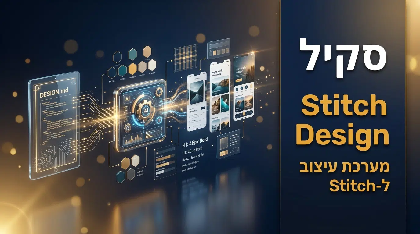
stitch-design-taste הוא סקיל לקלוד קוד שמייצר קבצי DESIGN.md מותאמים ל-Google Stitch, כלי יצירת המסכים של גוגל. במקום ש-Stitch ייצר מסכים גנריים, הסקיל מתרגם את עקרונות העיצוב האנטי-סלופ לשפה הסמנטית של Stitch: טיפוגרפיה מחמירה, צבע מכויל, פריסות אסימטריות, מיקרו-תנועה מתמדת וביצועים מואצים. קובץ ה-DESIGN.md שנוצר משמש מקור אמת יחיד שמנחה את Stitch לייצר מסכים פרימיום ולא גנריים. בפרויקטי הפיתוח שאני מוביל, שפת עיצוב אחידה היא הבסיס למוצר שנראה מכוון. במדריך תקבלו את שיטת העבודה המלאה, ארבעה תרחישי שימוש, וצ'קליסט איכות.
פקודת התקנה
npx skills add leonxlnx/taste-skill@stitch-design-taste -g -y
ההתקנה מתבצעת דרך מנהל החבילות הרשמי של הסקילים בפקודה אחת. הסקיל הוא קובץ Markdown פתוח מאוסף סקילי העיצוב של leonxlnx. אפשר להוריד ולבדוק את הקוד דרך הכפתורים שבראש העמוד.
מה הסקיל כולל?
הסקיל מתעד יצירה של קובץ DESIGN.md ל-Google Stitch: ניתוח וסינתזה של שפת העיצוב, והגדרת תמה, צבע, טיפוגרפיה, רכיבים, פריסה, תנועה ואנטי-דפוסים בשפה שה-AI של Stitch מבין.
קוד הסקיל המלא
---
name: stitch-design-taste
description: Semantic Design System Skill for Google Stitch. Generates agent-friendly DESIGN.md files that enforce premium, anti-generic UI standards — strict typography, calibrated color, asymmetric layouts, perpetual micro-motion, and hardware-accelerated performance.
---

# Stitch Design Taste — Semantic Design System Skill

## Overview
This skill generates `DESIGN.md` files optimized for Google Stitch screen generation. It translates the battle-tested anti-slop frontend engineering directives into Stitch's native semantic design language — descriptive, natural-language rules paired with precise values that Stitch's AI agent can interpret to produce premium, non-generic interfaces.

The generated `DESIGN.md` serves as the **single source of truth** for prompting Stitch to generate new screens that align with a curated, high-agency design language. Stitch interprets design through **"Visual Descriptions"** supported by specific color values, typography specs, and component behaviors.

## Prerequisites
- Access to Google Stitch via [labs.google/stitch](https://labs.google/stitch)
- Optionally: Stitch MCP Server for programmatic integration with Cursor, Antigravity, or Gemini CLI

## The Goal
Generate a `DESIGN.md` file that encodes:
1. **Visual atmosphere** — the mood, density, and design philosophy
2. **Color calibration** — neutrals, accents, and banned patterns with hex codes
3. **Typographic architecture** — font stacks, scale hierarchy, and anti-patterns
4. **Component behaviors** — buttons, cards, inputs with interaction states
5. **Layout principles** — grid systems, spacing philosophy, responsive strategy
6. **Motion philosophy** — animation engine specs, spring physics, perpetual micro-interactions
7. **Anti-patterns** — explicit list of banned AI design clichés

## Analysis & Synthesis Instructions

### 1. Define the Atmosphere
Evaluate the target project's intent. Use evocative adjectives from the taste spectrum:
- **Density:** "Art Gallery Airy" (1–3) → "Daily App Balanced" (4–7) → "Cockpit Dense" (8–10)
- **Variance:** "Predictable Symmetric" (1–3) → "Offset Asymmetric" (4–7) → "Artsy Chaotic" (8–10)
- **Motion:** "Static Restrained" (1–3) → "Fluid CSS" (4–7) → "Cinematic Choreography" (8–10)

Default baseline: Variance 8, Motion 6, Density 4. Adapt dynamically based on user's vibe description.

### 2. Map the Color Palette
For each color provide: **Descriptive Name** + **Hex Code** + **Functional Role**.

**Mandatory constraints:**
- Maximum 1 accent color. Saturation below 80%
- The "AI Purple/Blue Neon" aesthetic is strictly BANNED — no purple button glows, no neon gradients
- Use absolute neutral bases (Zinc/Slate) with high-contrast singular accents
- Stick to one palette for the entire output — no warm/cool gray fluctuation
- Never use pure black (`#000000`) — use Off-Black, Zinc-950, or Charcoal

### 3. Establish Typography Rules
- **Display/Headlines:** Track-tight, controlled scale. Not screaming. Hierarchy through weight and color, not just massive size
- **Body:** Relaxed leading, max 65 characters per line
- **Font Selection:** `Inter` is BANNED for premium/creative contexts. Force unique character: `Geist`, `Outfit`, `Cabinet Grotesk`, or `Satoshi`
- **Serif Ban:** Generic serif fonts (`Times New Roman`, `Georgia`, `Garamond`, `Palatino`) are BANNED. If serif is needed for editorial/creative contexts, use only distinctive modern serifs: `Fraunces`, `Gambarino`, `Editorial New`, or `Instrument Serif`. Serif is always BANNED in dashboards or software UIs
- **Dashboard Constraint:** Use Sans-Serif pairings exclusively (`Geist` + `Geist Mono` or `Satoshi` + `JetBrains Mono`)
- **High-Density Override:** When density exceeds 7, all numbers must use Monospace

### 4. Define the Hero Section
The Hero is the first impression and must be creative, striking, and never generic:
- **Inline Image Typography:** Embed small, contextual photos or visuals directly between words or letters in the headline. Images sit inline at type-height, rounded, acting as visual punctuation. This is the signature creative technique
- **No Overlapping:** Text must never overlap images or other text. Every element occupies its own clean spatial zone
- **No Filler Text:** "Scroll to explore", "Swipe down", scroll arrow icons, bouncing chevrons are BANNED. The content should pull users in naturally
- **Asymmetric Structure:** Centered Hero layouts BANNED when variance exceeds 4
- **CTA Restraint:** Maximum one primary CTA. No secondary "Learn more" links

### 5. Describe Component Stylings
For each component type, describe shape, color, shadow depth, and interaction behavior:
- **Buttons:** Tactile push feedback on active state. No neon outer glows. No custom mouse cursors
- **Cards:** Use ONLY when elevation communicates hierarchy. Tint shadows to background hue. For high-density layouts, replace cards with border-top dividers or negative space
- **Inputs/Forms:** Label above input, helper text optional, error text below. Standard gap spacing
- **Loading States:** Skeletal loaders matching layout dimensions — no generic circular spinners
- **Empty States:** Composed compositions indicating how to populate data
- **Error States:** Clear, inline error reporting

### 6. Define Layout Principles
- No overlapping elements — every element occupies its own clear spatial zone. No absolute-positioned content stacking
- Centered Hero sections are BANNED when variance exceeds 4 — force Split Screen, Left-Aligned, or Asymmetric Whitespace
- The generic "3 equal cards horizontally" feature row is BANNED — use 2-column Zig-Zag, asymmetric grid, or horizontal scroll
- CSS Grid over Flexbox math — never use `calc()` percentage hacks
- Contain layouts using max-width constraints (e.g., 1400px centered)
- Full-height sections must use `min-h-[100dvh]` — never `h-screen` (iOS Safari catastrophic jump)

### 7. Define Responsive Rules
Every design must work across all viewports:
- **Mobile-First Collapse (< 768px):** All multi-column layouts collapse to single column. No exceptions
- **No Horizontal Scroll:** Horizontal overflow on mobile is a critical failure
- **Typography Scaling:** Headlines scale via `clamp()`. Body text minimum `1rem`/`14px`
- **Touch Targets:** All interactive elements minimum `44px` tap target
- **Image Behavior:** Inline typography images (photos between words) stack below headline on mobile
- **Navigation:** Desktop horizontal nav collapses to clean mobile menu
- **Spacing:** Vertical section gaps reduce proportionally (`clamp(3rem, 8vw, 6rem)`)

### 8. Encode Motion Philosophy
- **Spring Physics default:** `stiffness: 100, damping: 20` — premium, weighty feel. No linear easing
- **Perpetual Micro-Interactions:** Every active component should have an infinite loop state (Pulse, Typewriter, Float, Shimmer)
- **Staggered Orchestration:** Never mount lists instantly — use cascade delays for waterfall reveals
- **Performance:** Animate exclusively via `transform` and `opacity`. Never animate `top`, `left`, `width`, `height`. Grain/noise filters on fixed pseudo-elements only

### 9. List Anti-Patterns (AI Tells)
Encode these as explicit "NEVER DO" rules in the DESIGN.md:
- No emojis anywhere
- No `Inter` font
- No generic serif fonts (`Times New Roman`, `Georgia`, `Garamond`) — distinctive modern serifs only if needed
- No pure black (`#000000`)
- No neon/outer glow shadows
- No oversaturated accents
- No excessive gradient text on large headers
- No custom mouse cursors
- No overlapping elements — clean spatial separation always
- No 3-column equal card layouts
- No generic names ("John Doe", "Acme", "Nexus")
- No fake round numbers (`99.99%`, `50%`)
- No AI copywriting clichés ("Elevate", "Seamless", "Unleash", "Next-Gen")
- No filler UI text: "Scroll to explore", "Swipe down", scroll arrows, bouncing chevrons
- No broken Unsplash links — use `picsum.photos` or SVG avatars
- No centered Hero sections (for high-variance projects)

## Output Format (DESIGN.md Structure)

```markdown
# Design System: [Project Title]

## 1. Visual Theme & Atmosphere
(Evocative description of the mood, density, variance, and motion intensity.
Example: "A restrained, gallery-airy interface with confident asymmetric layouts
and fluid spring-physics motion. The atmosphere is clinical yet warm — like a
well-lit architecture studio.")

## 2. Color Palette & Roles
- **Canvas White** (#F9FAFB) — Primary background surface
- **Pure Surface** (#FFFFFF) — Card and container fill
- **Charcoal Ink** (#18181B) — Primary text, Zinc-950 depth
- **Muted Steel** (#71717A) — Secondary text, descriptions, metadata
- **Whisper Border** (rgba(226,232,240,0.5)) — Card borders, 1px structural lines
- **[Accent Name]** (#XXXXXX) — Single accent for CTAs, active states, focus rings
(Max 1 accent. Saturation < 80%. No purple/neon.)

## 3. Typography Rules
- **Display:** [Font Name] — Track-tight, controlled scale, weight-driven hierarchy
- **Body:** [Font Name] — Relaxed leading, 65ch max-width, neutral secondary color
- **Mono:** [Font Name] — For code, metadata, timestamps, high-density numbers
- **Banned:** Inter, generic system fonts for premium contexts. Serif fonts banned in dashboards.

## 4. Component Stylings
* **Buttons:** Flat, no outer glow. Tactile -1px translate on active. Accent fill for primary, ghost/outline for secondary.
* **Cards:** Generously rounded corners (2.5rem). Diffused whisper shadow. Used only when elevation serves hierarchy. High-density: replace with border-top dividers.
* **Inputs:** Label above, error below. Focus ring in accent color. No floating labels.
* **Loaders:** Skeletal shimmer matching exact layout dimensions. No circular spinners.
* **Empty States:** Composed, illustrated compositions — not just "No data" text.

## 5. Layout Principles
(Grid-first responsive architecture. Asymmetric splits for Hero sections.
Strict single-column collapse below 768px. Max-width containment.
No flexbox percentage math. Generous internal padding.)

## 6. Motion & Interaction
(Spring physics for all interactive elements. Staggered cascade reveals.
Perpetual micro-loops on active dashboard components. Hardware-accelerated
transforms only. Isolated Client Components for CPU-heavy animations.)

## 7. Anti-Patterns (Banned)
(Explicit list of forbidden patterns: no emojis, no Inter, no pure black,
no neon glows, no 3-column equal grids, no AI copywriting clichés,
no generic placeholder names, no broken image links.)
```

## Best Practices
- **Be Descriptive:** "Deep Charcoal Ink (#18181B)" — not just "dark text"
- **Be Functional:** Explain what each element is used for
- **Be Consistent:** Same terminology throughout the document
- **Be Precise:** Include exact hex codes, rem values, pixel values in parentheses
- **Be Opinionated:** This is not a neutral template — it enforces a specific, premium aesthetic

## Tips for Success
1. Start with the atmosphere — understand the vibe before detailing tokens
2. Look for patterns — identify consistent spacing, sizing, and styling
3. Think semantically — name colors by purpose, not just appearance
4. Consider hierarchy — document how visual weight communicates importance
5. Encode the bans — anti-patterns are as important as the rules themselves

## Common Pitfalls to Avoid
- Using technical jargon without translation ("rounded-xl" instead of "generously rounded corners")
- Omitting hex codes or using only descriptive names
- Forgetting functional roles of design elements
- Being too vague in atmosphere descriptions
- Ignoring the anti-pattern list — these are what make the output premium
- Defaulting to generic "safe" designs instead of enforcing the curated aesthetic
מה זה stitch-design-taste ולמה הסקיל הזה שונה?
stitch-design-taste פותר בעיה ספציפית למשתמשי Google Stitch: כלי יצירת המסכים של גוגל עוצמתי, אבל בלי הכוונה נכונה הוא מייצר מסכים גנריים. הסקיל נותן ל-Stitch מקור אמת עיצובי, קובץ DESIGN.md, שמכוון אותו לתוצאה פרימיום ועקבית במקום ברירת מחדל.
מה שמייחד אותו הוא התרגום לשפה הסמנטית של Stitch. הסקיל לא סתם נותן הנחיות עיצוב, אלא מתרגם את עקרונות העיצוב האנטי-סלופ לשפה הטבעית שה-AI של Stitch מבין: כללים תיאוריים בשילוב ערכים מדויקים. הוא מגדיר תמה, מערכת צבעים ותפקידים, טיפוגרפיה מחמירה, פריסות אסימטריות, מיקרו-תנועה מתמדת, ורשימת אנטי-דפוסים אסורים. כל זה בקובץ אחד שמשמש מקור אמת לכל מסך חדש ש-Stitch מייצר.
ההבדל מורגש בעקביות ובאיכות של פלט Stitch. במקום מסכים גנריים, מקבלים שפה עיצובית אחידה ומכוונת. בשילוב עם סקיל UI/UX Pro Max לבסיס ההחלטות, אפשר לבנות שפת עיצוב עשירה ואז להחיל אותה דרך Stitch, וזה צירוף חזק למי שמשתמש בכלי.
מה stitch-design-taste נותן לקלוד קוד?
הסקיל מוסיף לקלוד את היכולת להפוך את Google Stitch מכלי שמייצר מסכים גנריים לכלי שמייצר עיצוב פרימיום ועקבי, דרך מקור אמת עיצובי.
מקור אמת ב-DESIGN.md
הסקיל יוצר קובץ DESIGN.md שמשמש מקור אמת יחיד לעיצוב. כל מסך ש-Stitch מייצר נשען עליו, כך שכל המסכים מדברים באותה שפה עיצובית, במקום שכל אחד ייראה אחרת לפי גחמת הרגע.
שפה סמנטית ל-Stitch
הסקיל מתרגם עקרונות עיצוב לשפה הטבעית שה-AI של Stitch מבין: כללים תיאוריים בשילוב ערכים מדויקים. כך ההכוונה לא הולכת לאיבוד בתרגום, ו-Stitch מפיק בדיוק את הסגנון שהוגדר.
עקרונות אנטי-סלופ
הסקיל מחיל את עקרונות העיצוב האנטי-גנריים: טיפוגרפיה מחמירה, צבע מכויל, פריסות אסימטריות ומיקרו-תנועה. אלה בדיוק הפרטים שמבדילים מסך פרימיום ממסך תבניתי, וה-DESIGN.md אוכף אותם.
רשימת אנטי-דפוסים
הקובץ כולל רשימה של דפוסים אסורים, כך ש-Stitch יודע ממה להימנע. זה מונע את המראה הגנרי שמסגיר פלט אוטומטי, ושומר על כל המסכים ברמה גבוהה ועקבית.
ארבע היכולות הופכות את Stitch מכלי גנרי לכלי פרימיום. בעבודות שלי, מקור אמת עיצובי אחד הבטיח שכל המסכים שנוצרו יישארו עקביים ומכוונים, ולא אוסף סגנונות מקרי.
למי הסקיל הזה מתאים?
משתמשי Google Stitch: זה הקהל המובהק. מי שמשתמש ב-Stitch ליצירת מסכים מקבל מקור אמת שמשדרג את הפלט מגנרי לפרימיום. השילוב עם סקיל shadcn מחבר בין שפת העיצוב לרכיבים נקיים במימוש.
מעצבי מוצר: הסקיל מאפשר להגדיר שפת עיצוב פעם אחת ולהחיל אותה על כל המסכים דרך Stitch, כך שהעקביות נשמרת בלי עבודה ידנית בכל מסך.
צוותים שבונים אפליקציות: כשכמה אנשים מייצרים מסכים, מקור אמת עיצובי משותף מבטיח שכולם נשארים באותה שפה. זה מונע פיצול סגנוני באפליקציה.
סטארטאפים שצריכים מסכים מהר: Stitch מייצר מסכים במהירות, והסקיל מבטיח שהם גם יראו טוב. גם בעבודות קידום אורגני שלי, ממשק מלוטש תורם לחוויה ולשהייה באתר.
פרילנסרים ומעצבים עצמאיים: הסקיל מאיץ את העבודה עם Stitch ומעלה את רמת התוצאה, כך שאפשר להוציא עבודות איכותיות בקצב גבוה.
מי שפחות יתאים: מי שלא משתמש ב-Google Stitch לא יפיק מהסקיל את מלוא הערך, כי הוא מותאם ספציפית לכלי הזה. למי שעובד בשיטות עיצוב אחרות, סקילי עיצוב כלליים יותר יתאימו טוב יותר.
איך stitch-design-taste עזר לי בפרויקטים אמיתיים
מסכי Stitch שהפסיקו להיראות גנריים
מסכים שיצרתי ב-Stitch נראו תבניתיים. הסקיל יצר קובץ DESIGN.md עם טיפוגרפיה, צבע ופריסות מוגדרים, ו-Stitch התחיל לייצר מסכים פרימיום. אותו כלי, תוצאה אחרת לגמרי, כי הייתה לו הכוונה עיצובית ברורה.
עקביות בין כל מסכי האפליקציה
מסכים שונים באפליקציה נראו כמו עוצבו בנפרד. ה-DESIGN.md של הסקיל שימש מקור אמת אחד, וכל מסך חדש נשען עליו. האפליקציה קיבלה שפה עיצובית אחידה, בלי פיצול סגנוני בין המסכים.
הגדרת שפת עיצוב פעם אחת
במקום לכוון את Stitch מחדש בכל מסך, הגדרתי את שפת העיצוב פעם אחת ב-DESIGN.md. מאותו רגע, כל מסך חדש יצא תואם אוטומטית. זה חסך זמן עצום ושמר על איכות עקבית לאורך כל הפרויקט.
מניעת דפוסים גנריים
רשימת האנטי-דפוסים בקובץ מנעה מ-Stitch ליפול לדפוסים השחוקים. המסכים נשארו נקיים ומכוונים, והמראה הגנרי שמסגיר פלט אוטומטי פשוט לא הופיע. האיכות נשמרה גבוהה לאורך כל היצירה.
ארבעת המקרים מראים שהסקיל הופך את Google Stitch מכלי מהיר לכלי מהיר ואיכותי. כשיש מקור אמת עיצובי אחד, כל המסכים נשארים פרימיום ועקביים, והכוח של Stitch מתועל לתוצאה מכוונת.
סיכום
סקיל stitch-design-taste הוא כלי מצוין למשתמשי Google Stitch. הוא יוצר קובץ DESIGN.md שמשמש מקור אמת עיצובי, ומתרגם עקרונות אנטי-סלופ לשפה הסמנטית של Stitch, כך שכל מסך שנוצר יוצא פרימיום ועקבי במקום גנרי.
אם אתם משתמשים ב-Stitch, בקשו מקלוד לייצר קובץ DESIGN.md עם הסקיל, ואז השתמשו בו כמקור אמת. תראו איך הפלט של Stitch משתדרג מתבנית לעיצוב מכוון. משם, כל מסך נשען על אותה שפה.
בפוסטים הבאים אמשיך לסקור את הסקילים החזקים ביותר לעיצוב ולפיתוח. האתר של דביר נעמן מרכז את כל הכלים, השיטות והליווי שאני מציע לעסקים שרוצים נוכחות דיגיטלית מנצחת עם בינה מלאכותית.
שיתוף הסקיל
שאלות ותשובות
מה זה בעצם הסקיל stitch-design-taste?
זה סקיל לקלוד קוד שמייצר קבצי DESIGN.md מותאמים ל-Google Stitch, כלי יצירת המסכים של גוגל. הקובץ משמש מקור אמת עיצובי שמכוון את Stitch לייצר מסכים פרימיום ועקביים במקום גנריים, על ידי תרגום עקרונות עיצוב לשפה הסמנטית שהכלי מבין.
מה זה Google Stitch?
Google Stitch הוא כלי בינה מלאכותית של גוגל ליצירת מסכי ממשק. הוא עוצמתי, אבל בלי הכוונה נכונה הוא נוטה לייצר מסכים גנריים. הסקיל נותן לו מקור אמת עיצובי בקובץ DESIGN.md, כך שהפלט שלו יוצא מכוון ואיכותי ולא ברירת מחדל.
איך מתקינים את הסקיל בקלוד קוד?
בפקודה אחת דרך מנהל החבילות הרשמי של הסקילים, כפי שמופיע בקופסת ההתקנה למעלה. הסקיל הוא קובץ Markdown פתוח מאוסף סקילי העיצוב של leonxlnx. אחרי ההתקנה בקשו מקלוד לייצר DESIGN.md למותג או לפרויקט שלכם.
מה זה קובץ DESIGN.md?
זה קובץ שמרכז את שפת העיצוב של הפרויקט בפורמט שה-AI של Stitch מבין: תמה, צבעים, טיפוגרפיה, רכיבים, פריסה, תנועה ואנטי-דפוסים. הוא משמש מקור אמת יחיד, כך שכל מסך ש-Stitch מייצר נשען עליו ויוצא עקבי עם השאר.
האם הסקיל דורש מפתח API?
הסקיל עצמו הוא קובץ הנחיות פתוח שמייצר קובץ DESIGN.md מקומי, בלי מפתחות API בתוכו. השימוש בפועל ב-Google Stitch דורש גישה לכלי של גוגל, אבל זו הגישה הקיימת שלכם ולא מפתח שמוטמע בסקיל. הסקיל פשוט מספק את ההכוונה העיצובית.
האם אפשר להשתמש בסקיל בלי Stitch?
הסקיל מותאם ספציפית ל-Google Stitch ולשפה הסמנטית שלו, ולכן שם הוא מפיק את מלוא הערך. הקובץ שנוצר הוא בעצם מסמך עקרונות עיצוב, כך שהוא יכול לשמש כהשראה גם מחוץ ל-Stitch, אבל למי שעובד בשיטות אחרות עדיף סקיל עיצוב כללי יותר.
האם הסקיל מבטיח עקביות בין מסכים?
כן, זו אחת ממטרותיו המרכזיות. כיוון שכל המסכים נשענים על אותו קובץ DESIGN.md כמקור אמת, הם מדברים באותה שפה עיצובית. זה מונע מצב שבו כל מסך נראה אחרת, ושומר על אפליקציה מגובשת ועקבית גם כשמייצרים הרבה מסכים.
האם הסקיל מתאים גם למי שאינו מעצב?
בהחלט. הסקיל מביא את עקרונות העיצוב ואת ההגדרות, כך שגם מי שאין לו רקע עיצובי מקבל קובץ DESIGN.md מקצועי ש-Stitch ישתמש בו. צריך רק לתאר את המותג והכיוון, והסקיל מתרגם את זה לשפת עיצוב מלאה.