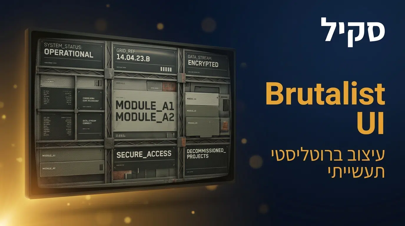
סקיל Brutalist UI
industrial-brutalist-ui הוא סקיל עיצוב לקלוד קוד לסגנון ברוטליסטי תעשייתי: ממשקים גולמיים ומכניים שמשלבים טיפוגרפיה שוויצרית מודפסת עם אסתטיקה של טרמינל צבאי. גרידים נוקשים, ניגוד קיצוני בגודל הטקסט, פלטת צבעים תכליתית, ואפקטים של דגרדציה אנלוגית כמו הלפטון וקווי סריקה. התוצאה היא ממשק שמרגיש כמו בלוטפרינט מסווג או מדריך הפעלה תעשייתי, מושלם לדשבורדים עתירי נתונים, פורטפוליו ואתרים עריכתיים עם אופי חזק. בפרויקטי הפיתוח שאני מוביל, סגנון נועז ובלתי מתפשר מבדל מותג מהים הגנרי. במדריך תקבלו את הפרוטוקול המלא, ארבעה תרחישי שימוש, וצ'קליסט איכות.
פקודת התקנה
npx skills add leonxlnx/taste-skill@industrial-brutalist-ui -g -y
ההתקנה מתבצעת דרך מנהל החבילות הרשמי של הסקילים בפקודה אחת. הסקיל הוא קובץ Markdown פתוח מאוסף סקילי העיצוב של leonxlnx. אפשר להוריד ולבדוק את הקוד דרך הכפתורים שבראש העמוד.
מה הסקיל כולל?
הסקיל בנוי כפרוטוקול עיצוב ברוטליסטי: ארכיטיפים חזותיים, היררכיה טיפוגרפית עם ניגוד קיצוני, פלטה תכליתית, גרידים נוקשים, ואפקטי דגרדציה אנלוגית.
קוד הסקיל המלא
---
name: industrial-brutalist-ui
description: Raw mechanical interfaces fusing Swiss typographic print with military terminal aesthetics. Rigid grids, extreme type scale contrast, utilitarian color, analog degradation effects. For data-heavy dashboards, portfolios, or editorial sites that need to feel like declassified blueprints.
---

# SKILL: Industrial Brutalism & Tactical Telemetry UI

## 1. Skill Meta
**Name:** Industrial Brutalism & Tactical Telemetry Interface Engineering
**Description:** Advanced proficiency in architecting web interfaces that synthesize mid-century Swiss Typographic design, industrial manufacturing manuals, and retro-futuristic aerospace/military terminal interfaces. This discipline requires absolute mastery over rigid modular grids, extreme typographic scale contrast, purely utilitarian color palettes, and the programmatic simulation of analog degradation (halftones, CRT scanlines, bitmap dithering). The objective is to construct digital environments that project raw functionality, mechanical precision, and high data density, deliberately discarding conventional consumer UI patterns.

## 2. Visual Archetypes
The design system operates by merging two distinct but highly compatible visual paradigms. **Pick ONE per project and commit to it. Do not alternate or mix both modes within the same interface.**

### 2.1 Swiss Industrial Print
Derived from 1960s corporate identity systems and heavy machinery blueprints.
*   **Characteristics:** High-contrast light modes (newsprint/off-white substrates). Reliance on monolithic, heavy sans-serif typography. Unforgiving structural grids outlined by visible dividing lines. Aggressive, asymmetric use of negative space punctuated by oversized, viewport-bleeding numerals or letterforms. Heavy use of primary red as an alert/accent color.

### 2.2 Tactical Telemetry & CRT Terminal
Derived from classified military databases, legacy mainframes, and aerospace Heads-Up Displays (HUDs).
*   **Characteristics:** Dark mode exclusivity. High-density tabular data presentation. Absolute dominance of monospaced typography. Integration of technical framing devices (ASCII brackets, crosshairs). Application of simulated hardware limitations (phosphor glow, scanlines, low bit-depth rendering).

## 3. Typographic Architecture
Typography is the primary structural and decorative infrastructure. Imagery is secondary. The system demands extreme variance in scale, weight, and spacing.

### 3.1 Macro-Typography (Structural Headers)
*   **Classification:** Neo-Grotesque / Heavy Sans-Serif.
*   **Optimal Web Fonts:** Neue Haas Grotesk (Black), Inter (Extra Bold/Black), Archivo Black, Roboto Flex (Heavy), Monument Extended.
*   **Implementation Parameters:**
    *   **Scale:** Deployed at massive scales using fluid typography (e.g., `clamp(4rem, 10vw, 15rem)`).
    *   **Tracking (Letter-spacing):** Extremely tight, often negative (`-0.03em` to `-0.06em`), forcing glyphs to form solid architectural blocks.
    *   **Leading (Line-height):** Highly compressed (`0.85` to `0.95`).
    *   **Casing:** Exclusively uppercase for structural impact.

### 3.2 Micro-Typography (Data & Telemetry)
*   **Classification:** Monospace / Technical Sans.
*   **Optimal Web Fonts:** JetBrains Mono, IBM Plex Mono, Space Mono, VT323, Courier Prime.
*   **Implementation Parameters:**
    *   **Scale:** Fixed and small (`10px` to `14px` / `0.7rem` to `0.875rem`).
    *   **Tracking:** Generous (`0.05em` to `0.1em`) to simulate mechanical typewriter spacing or terminal matrices.
    *   **Leading:** Standard to tight (`1.2` to `1.4`).
    *   **Casing:** Exclusively uppercase. Used for all metadata, navigation, unit IDs, and coordinates.

### 3.3 Textural Contrast (Artistic Disruption)
*   **Classification:** High-Contrast Serif.
*   **Optimal Web Fonts:** Playfair Display, EB Garamond, Times New Roman.
*   **Implementation Parameters:** Used exceedingly sparingly. Must be subjected to heavy post-processing (halftone filters, 1-bit dithering) to degrade vector perfection and create textural juxtaposition against the clean sans-serifs.

## 4. Color System
The color architecture is uncompromising. Gradients, soft drop shadows, and modern translucency are strictly prohibited. Colors simulate physical media or primitive emissive displays.

**CRITICAL: Choose ONE substrate palette per project and use it consistently. Never mix light and dark substrates within the same interface.**

### If Swiss Industrial Print (Light):
*   **Background:** `#F4F4F0` or `#EAE8E3` (Matte, unbleached documentation paper).
*   **Foreground:** `#050505` to `#111111` (Carbon Ink).
*   **Accent:** `#E61919` or `#FF2A2A` (Aviation/Hazard Red). This is the ONLY accent color. Used for strike-throughs, thick structural dividing lines, or vital data highlights.

### If Tactical Telemetry (Dark):
*   **Background:** `#0A0A0A` or `#121212` (Deactivated CRT. Avoid pure `#000000`).
*   **Foreground:** `#EAEAEA` (White phosphor). This is the primary text color.
*   **Accent:** `#E61919` or `#FF2A2A` (Aviation/Hazard Red). Same red, same rules.
*   **Terminal Green (`#4AF626`):** Optional. Use ONLY for a single specific UI element (e.g., one status indicator or one data readout) — never as a general text color. If it doesn't serve a clear purpose, omit it entirely.

## 5. Layout and Spatial Engineering
The layout must appear mathematically engineered. It rejects conventional web padding in favor of visible compartmentalization.

*   **The Blueprint Grid:** Strict adherence to CSS Grid architectures. Elements do not float; they are anchored precisely to grid tracks and intersections.
*   **Visible Compartmentalization:** Extensive utilization of solid borders (`1px` or `2px solid`) to delineate distinct zones of information. Horizontal rules (`<hr>`) frequently span the entire container width to segregate operational units.
*   **Bimodal Density:** Layouts oscillate between extreme data density (tightly packed monospace metadata clustered together) and vast expanses of calculated negative space framing macro-typography.
*   **Geometry:** Absolute rejection of `border-radius`. All corners must be exactly 90 degrees to enforce mechanical rigidity.

## 6. UI Components and Symbology
Standard web UI conventions are replaced with utilitarian, industrial graphic elements.

*   **Syntax Decoration:** Utilization of ASCII characters to frame data points.
    *   *Framing:* `[ DELIVERY SYSTEMS ]`, `< RE-IND >`
    *   *Directional:* `>>>`, `///`, `\\\\`
*   **Industrial Markers:** Prominent integration of registration (`®`), copyright (`©`), and trademark (`™`) symbols functioning as structural geometric elements rather than legal text.
*   **Technical Assets:** Integration of crosshairs (`+`) at grid intersections, repeating vertical lines (barcodes), thick horizontal warning stripes, and randomized string data (e.g., `REV 2.6`, `UNIT / D-01`) to simulate active mechanical processes.

## 7. Textural and Post-Processing Effects
To prevent the design from appearing purely digital, simulated analog degradation is engineered into the frontend via CSS and SVG filters.

*   **Halftone and 1-Bit Dithering:** Transforming continuous-tone images or large serif typography into dot-matrix patterns. Achieved via pre-processing or CSS `mix-blend-mode: multiply` overlays combined with SVG radial dot patterns.
*   **CRT Scanlines:** For terminal interfaces, applying a `repeating-linear-gradient` to the background to simulate horizontal electron beam sweeps (e.g., `repeating-linear-gradient(0deg, transparent, transparent 2px, rgba(0,0,0,0.1) 2px, rgba(0,0,0,0.1) 4px)`).
*   **Mechanical Noise:** A global, low-opacity SVG static/noise filter applied to the DOM root to introduce a unified physical grain across both dark and light modes.

## 8. Web Engineering Directives
1.  **Grid Determinism:** Utilize `display: grid; gap: 1px;` with contrasting parent/child background colors to generate mathematically perfect, razor-thin dividing lines without complex border declarations.
2.  **Semantic Rigidity:** Construct the DOM using precise semantic tags (`<data>`, `<samp>`, `<kbd>`, `<output>`, `<dl>`) to accurately reflect the technical nature of the telemetry.
3.  **Typography Clamping:** Implement CSS `clamp()` functions exclusively for macro-typography to ensure massive text scales aggressively while maintaining structural integrity across viewports.
מה זה industrial-brutalist-ui ולמה הסקיל הזה שונה?
industrial-brutalist-ui פותר את הבעיה של אתרים שכולם נראים אותו דבר. בעולם של עיצוב מלוטש וגנרי, סגנון ברוטליסטי נועז בולט מיד ומשדר אופי. אבל ברוטליזם שנעשה לא נכון נראה פשוט מכוער ולא קריא. הסקיל מספק את המשמעת שהופכת אותו למכוון ומרשים ולא לכאוס.
מה שמייחד אותו הוא השילוב בין גולמיות לדיוק. הסקיל נשען על טיפוגרפיה שוויצרית מודפסת ועל אסתטיקה של מדריכי הפעלה תעשייתיים וטרמינלים צבאיים. הוא מגדיר גרידים נוקשים, ניגוד קיצוני בגודל הטקסט, פלטה תכליתית, ואפקטי דגרדציה אנלוגית כמו הלפטון וקווי סריקה. כל אלה מתוזמרים בקפדנות, כך שהתוצאה נראית כמו בלוטפרינט מסווג, גולמית אבל מדויקת, ולא כמו טעות עיצובית.
ההבדל מורגש בבידול. ממשק שנבנה עם הסקיל בלתי נשכח, בדיוק ההפך מהתבנית הגנרית. בשילוב עם סקיל UI/UX Pro Max לבסיס העיצוב, אפשר להחיל את הסגנון הנועז הזה בצורה עקבית על כל המוצר, וזה חזק במיוחד למותגים שרוצים להישמע אחרת.
מה industrial-brutalist-ui נותן לקלוד קוד?
הסקיל מוסיף לקלוד שליטה בסגנון ברוטליסטי מדויק: לבנות ממשקים נועזים ובלתי נשכחים שמשדרים אופי, בלי ליפול לכיעור או לחוסר קריאות.
גרידים נוקשים ומבנה תעשייתי
הסקיל בונה על גרידים מודולריים נוקשים בהשראת דפוס שוויצרי ומדריכי הפעלה תעשייתיים. המבנה הזה נותן לברוטליזם סדר וכוח, כך שהתוצאה נראית מכוונת ומהונדסת ולא אקראית.
ניגוד טיפוגרפי קיצוני
הסקיל משתמש בניגוד דרמטי בין כותרות ענק לטקסט קטן, מה שיוצר היררכיה חזקה ונוכחות. הטיפוגרפיה היא הגיבורה של הסגנון, וזה מה שמעניק לממשק את האופי הבלתי נשכח שלו.
אפקטי דגרדציה אנלוגית
הסקיל מדמה תכונות אנלוגיות כמו הלפטון, קווי סריקה של CRT ודיטרינג. האפקטים האלה מוסיפים מרקם ותחושת בלוטפרינט מסווג, והם מה שמבדיל את הסגנון מעיצוב דיגיטלי חלק וסטרילי.
פלטה תכליתית מאופקת
במקום צבעוניות עשירה, הסקיל משתמש בפלטה תכליתית ומאופקת, בדיוק כמו במכשור תעשייתי. הצבע משרת פונקציה ולא קישוט, וזה מחזק את התחושה הגולמית והמכנית של הממשק.
ארבע היכולות הופכות את קלוד למעצב ברוטליסטי מדויק. בעבודות שלי, סגנון נועז כזה הפך אתרים שגרתיים לבלתי נשכחים, בדיוק כשהמטרה הייתה לבלוט ולא להשתלב.
למי הסקיל הזה מתאים?
מעצבים ומפתחים שרוצים לבלוט: זה הקהל המובהק. כשכולם נראים אותו דבר, סגנון ברוטליסטי הוא בידול מיידי. השילוב עם סקיל shadcn נותן בסיס רכיבים שאפשר להלביש בסגנון הנועז.
פורטפוליו של יוצרים: פורטפוליו הוא הצהרה. סגנון ברוטליסטי משדר ביטחון ואופי, ומבדל את היוצר מאינספור פורטפוליו תבניתיים ומלוטשים.
דשבורדים עתירי נתונים: האסתטיקה התעשייתית והגרידים הנוקשים מתאימים במיוחד להצגת נתונים. ממשק שנראה כמו טרמינל בקרה משדר רצינות ושליטה.
אתרים עריכתיים ומגזינים: ברוטליזם בהשראת דפוס שוויצרי מצוין לתוכן עריכתי שרוצה אופי חזק. גם בעבודות קידום אורגני שלי, אתר עם זהות ויזואלית בולטת זוכה ליותר זכירות ושיתופים.
מותגים שרוצים אנטי-מיינסטרים: לסטארטאפים ולמותגים שרוצים להיתפס כנועזים ואותנטיים, הסגנון הזה הוא הצהרת עמדה ויזואלית.
מי שפחות יתאים: מותג שמרני, מוסדי או כזה שצריך לשדר נגישות וחמימות ימצא את הברוטליזם קר וקיצוני מדי. הסקיל מבריק דווקא כשהמטרה היא נוכחות ובידול.
איך industrial-brutalist-ui עזר לי בפרויקטים אמיתיים
פורטפוליו שבלט מהים הגנרי
יוצר רצה פורטפוליו עם אופי חזק. הסקיל בנה ממשק ברוטליסטי עם טיפוגרפיה ענקית, גריד נוקשה ואפקטי הלפטון. הפורטפוליו נראה כמו הצהרת עמדה, בלתי נשכח, ובלט מיד מול עשרות פורטפוליו מלוטשים וזהים.
דשבורד נתונים בסגנון טרמינל
דשבורד עתיר נתונים הרגיש גנרי. הסגנון התעשייתי של הסקיל, עם גרידים נוקשים ופלטה תכליתית, הפך אותו לטרמינל בקרה שמשדר שליטה ורצינות. הנתונים קיבלו הקשר ויזואלי שתאם את האופי המקצועי שלהם.
אתר מגזין עם זהות חזקה
אתר תוכן רצה להיראות אחרת. הסקיל יישם ברוטליזם בהשראת דפוס שוויצרי, עם ניגוד טיפוגרפי קיצוני ומבנה עריכתי. האתר קיבל זהות ויזואלית בלתי נשכחת, והזכירות שלו אצל הקוראים עלתה.
מותג שרצה להיתפס כנועז
סטארטאפ רצה להיתפס כנועז ואותנטי. במקום עיצוב מלוטש וצפוי, הסקיל נתן לו סגנון ברוטליסטי עם אופי. הזהות הוויזואלית הבולטת תאמה את המסר של המותג, ויצרה רושם ראשוני חזק ובלתי שגרתי.
ארבעת המקרים מראים שברוטליזם נכון הוא כלי בידול עוצמתי. כשהמטרה היא לבלוט ולהשאיר רושם, סגנון נועז ומדויק עושה את העבודה הרבה יותר טוב מעיצוב מלוטש שנבלע בים הגנרי.
סיכום
סקיל industrial-brutalist-ui הוא כלי מצוין לכל מי שרוצה ממשק נועז ובלתי נשכח. הוא מספק פרוטוקול ברוטליסטי מדויק, עם גרידים נוקשים, ניגוד טיפוגרפי קיצוני, פלטה תכליתית ואפקטי דגרדציה, שהופכים אתר רגיל להצהרה ויזואלית.
אם אתם מתחילים, בקשו מקלוד לעצב עמוד בסגנון ברוטליסטי עם הסקיל. תראו איך טיפוגרפיה נועזת וגריד נוקשה הופכים עמוד שגרתי למשהו עם אופי. משם, אפשר להחיל את הסגנון על מותג שלם.
בפוסטים הבאים אמשיך לסקור את הסקילים החזקים ביותר לעיצוב ולפיתוח. האתר של דביר נעמן מרכז את כל הכלים, השיטות והליווי שאני מציע לעסקים שרוצים נוכחות דיגיטלית מנצחת עם בינה מלאכותית.
שיתוף הסקיל
שאלות ותשובות
מה זה בעצם הסקיל industrial-brutalist-ui?
זה סקיל עיצוב לקלוד קוד לסגנון ברוטליסטי תעשייתי: ממשקים גולמיים ומכניים בהשראת טיפוגרפיה שוויצרית וטרמינלים צבאיים. הוא מגדיר גרידים נוקשים, ניגוד טיפוגרפי קיצוני, פלטה תכליתית ואפקטי דגרדציה אנלוגית. המטרה היא ממשק נועז ובלתי נשכח עם אופי חזק.
מה זה עיצוב ברוטליסטי?
ברוטליזם בעיצוב דיגיטלי הוא סגנון גולמי ובלתי מתפשר, עם טיפוגרפיה נועזת, גרידים נוקשים ומיעוט קישוט. הוא ההפך מהעיצוב המלוטש והצפוי, ולכן בולט מיד. הסקיל מוסיף לו דיוק תעשייתי, כך שהוא נראה מכוון ומהונדס ולא סתם מחוספס.
איך מתקינים את הסקיל בקלוד קוד?
בפקודה אחת דרך מנהל החבילות הרשמי של הסקילים, כפי שמופיע בקופסת ההתקנה למעלה. הסקיל הוא קובץ Markdown פתוח מאוסף סקילי העיצוב של leonxlnx. אחרי ההתקנה תארו לקלוד שתרצו סגנון ברוטליסטי, והסקיל ינחה אותו לאסתטיקה הנכונה.
האם ברוטליזם לא נראה מכוער?
ברוטליזם שנעשה לא נכון אכן יכול להיראות מכוער ולא קריא. הסקיל בדיוק נועד למנוע את זה: הוא מביא משמעת של גרידים, היררכיה טיפוגרפית ופלטה מדודה, כך שהתוצאה גולמית אבל מכוונת ומדויקת. זה ההבדל בין הצהרה ויזואלית חזקה לבין כאוס.
למי הסגנון הזה מתאים?
הוא מצטיין בפורטפוליו, דשבורדים עתירי נתונים, אתרים עריכתיים ומותגים שרוצים לבלוט ולהיתפס כנועזים. הוא פחות מתאים למותגים שמרניים או כאלה שצריכים לשדר חמימות ונגישות. כדאי להשתמש בו כשהמטרה היא נוכחות ובידול חזק.
מה זה אפקטי דגרדציה אנלוגית?
אלה אפקטים שמדמים מאפיינים של מדיה אנלוגית ישנה: הלפטון של דפוס, קווי סריקה של מסך CRT, ודיטרינג של ביטמאפ. הם מוסיפים מרקם ותחושת בלוטפרינט מסווג, ומבדילים את הסגנון מעיצוב דיגיטלי חלק וסטרילי. הסקיל מיישם אותם בצורה מדודה כדי לחזק את האופי.
האם הסקיל עובד עם עברית ו-RTL?
כן. עקרונות הברוטליזם, הגרידים והניגוד הטיפוגרפי אוניברסליים, וקלוד יודע ליישם אותם גם על פריסה מימין לשמאל. כדאי לבחור גופן עברי בעל אופי שמתאים לסגנון ולוודא שהוא תומך בעברית, כדי לשמר את הנוכחות גם בטקסט העברי.
האם הסקיל מתאים גם למי שאינו מעצב?
בהחלט. הסקיל מביא את כל ההחלטות העיצוביות של הסגנון, גרידים, טיפוגרפיה, פלטה ואפקטים, כך שמפתח או יזם ללא רקע עיצובי מקבל ממשק ברוטליסטי מקצועי. צריך רק לבקש את הסגנון, והסקיל מטפל בפרטים שהופכים אותו למדויק ולא מחוספס.